
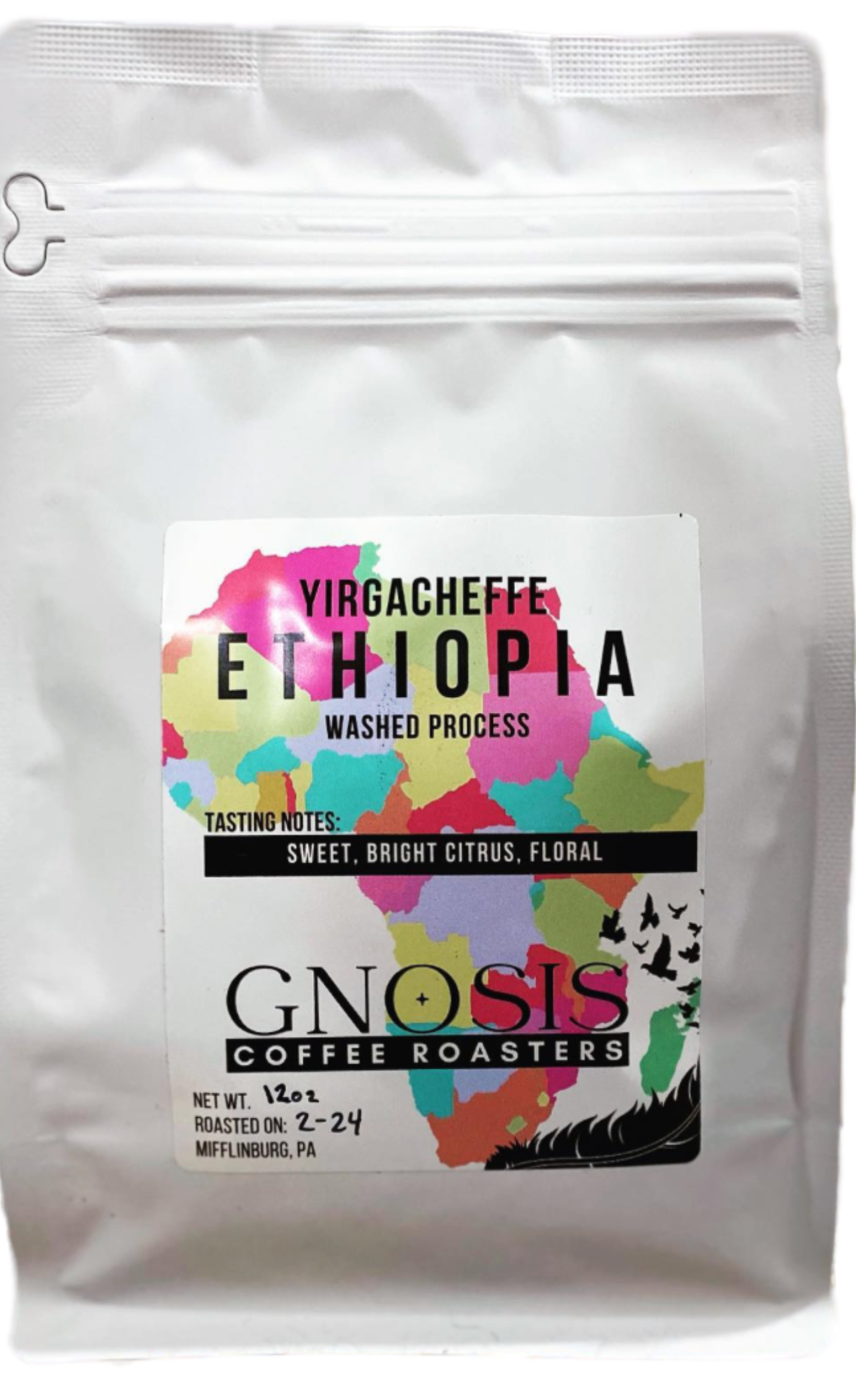
I teamed up with Gnosis Coffee Roasters to bring their packaging into the modern design age. As many coffee companies continue to push the boundaries of package design with engaging artistic, eye-catching designs, we didn’t want Gnosis to get left behind!
As Gnosis continues to savor the sweet taste of success and expand into new communities, the demand for their carefully roasted beans has surged. With increased production comes the need for a reliable partner in packaging—a journey that led them to seek out a new bag manufacturer.
Alongside this pivotal decision comes the opportunity to reimagine the packaging design, ensuring it reflects the essence of their brand while embracing the exciting prospects of growth and what makes them unique.
My mission was clear: to elevate their packaging design while preserving the essence of their brand identity.
Bringing Coffee and art together to deliver
Creating an engaging, eye-catching, artful design that reflects the company’s exciting new growth and uniqueness while remaining within their brand identity.
A design that incorporates and expands upon their existing and recognizable branding, while incorporating artful designs that highlight what makes them unique.

.png)
Minimalist - no design elements on the bag, itself.
Coffee roasters push the boundaries of package design. With vibrant colors, textures, and patterns, there are a lot of inspiring designs out there.
Analyzing the market to determine what design choices were being made by coffee company contemporaries, I pulled notes from modern designs - including, patterns, colors, and even spacing - to brainstorm ideas for a new, modern look for Gnosis.
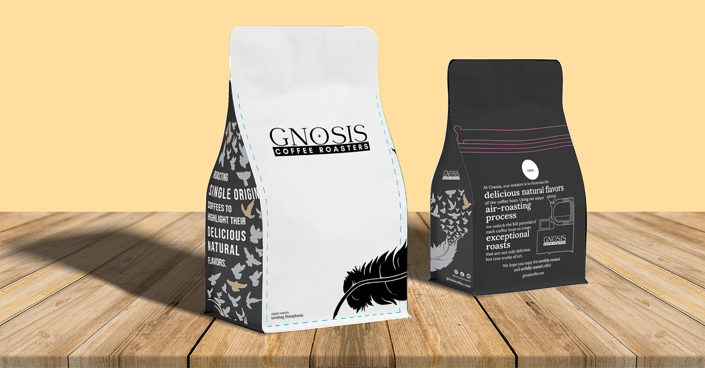
Adjust visual hierarchy of the original packaging - moving the logo to the top of the bag, making it the first prominent feature.
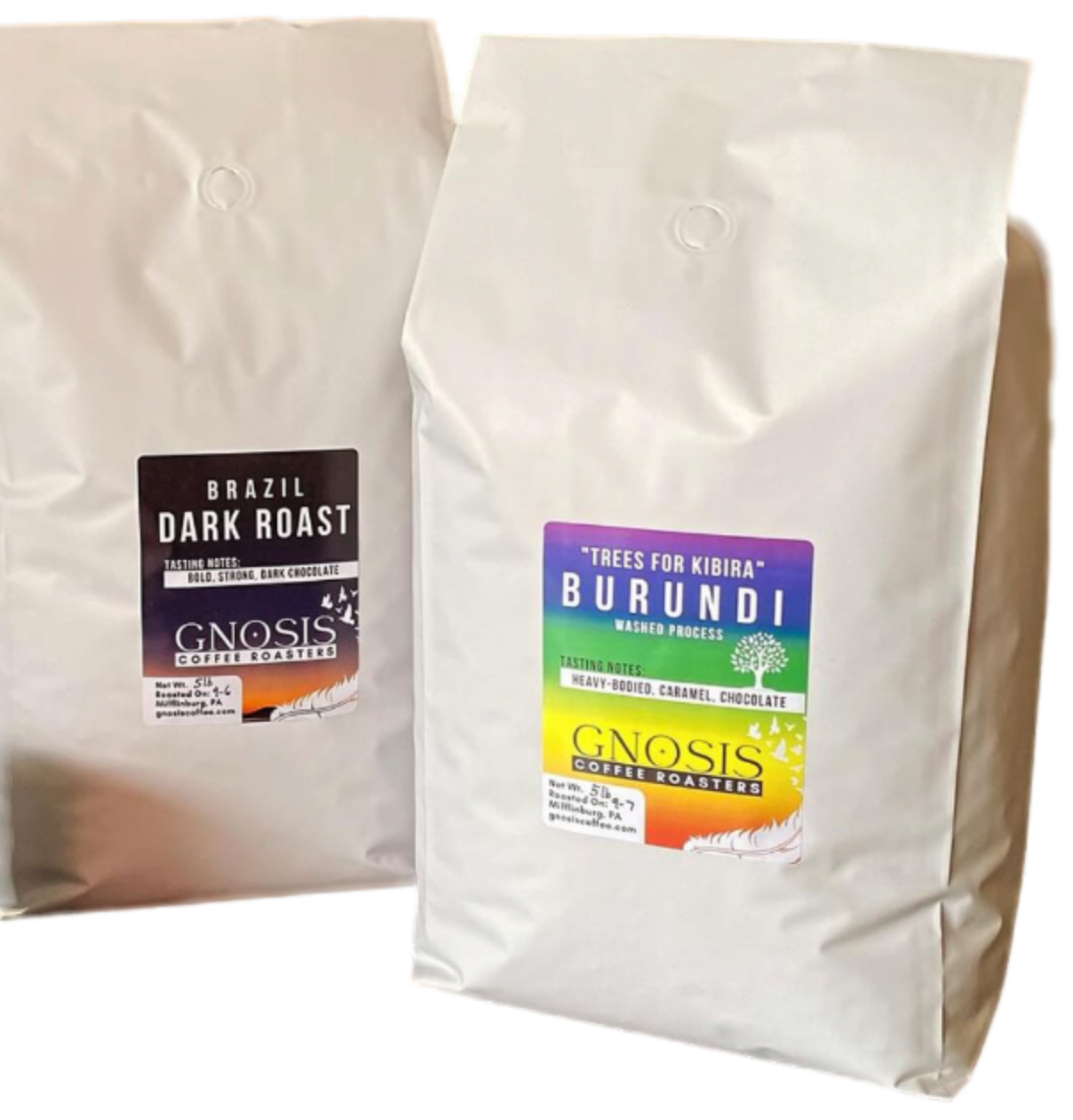
Sticker placeholder (The client indicated that the information about the specific roasts would be incorporated as stickers).
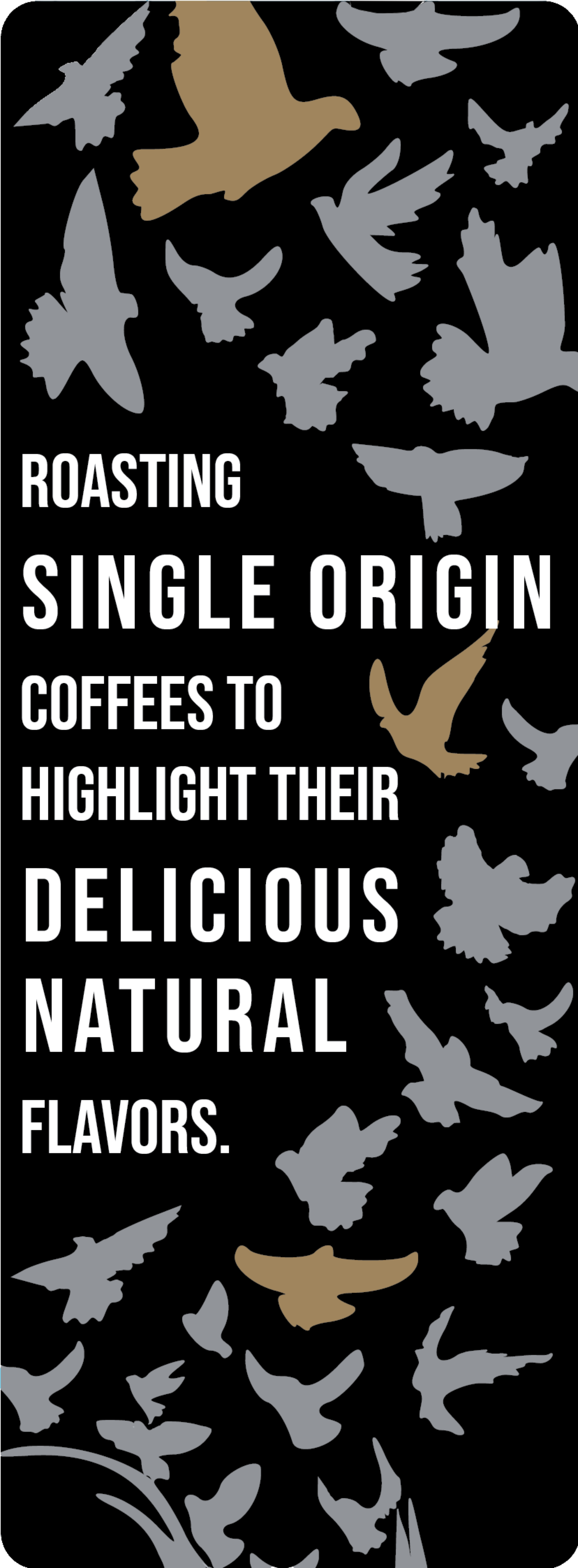
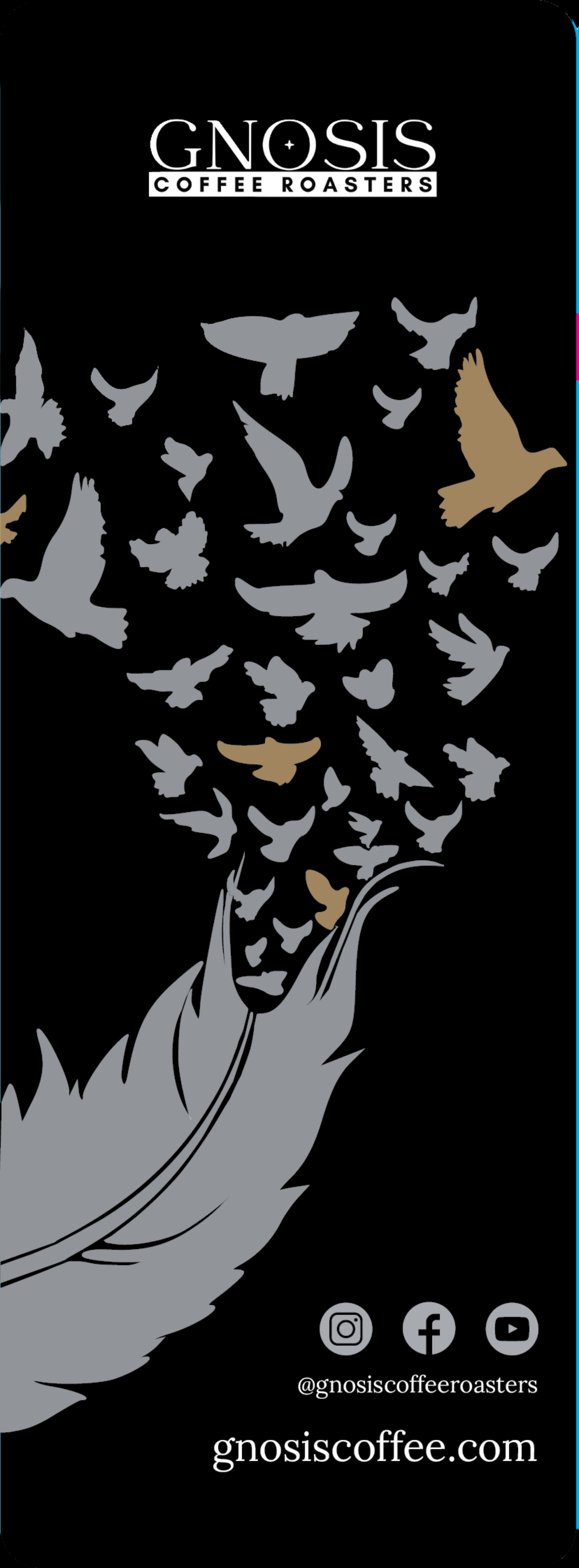
Visual Intrigue: Offset “Feather and Birds” logo & wrap it around the right side of the bag.
Pattern and quote that represents the brand on the left side - distinguishing it from the rest of the bag.
Include coffee-related icons/graphics to elevate the aesthetics:
Coffee mugs, coffee beans, a coffee bag seemed “too generic”...
Copywriting - either existing, or something original - would tell the story of what makes Gnosis special:
what sets them apart from other roasters?
why buy their coffee over someone else’s?
One of the most important things to keep in mind during this stage was the existing branding for Gnosis, i.e. logos and aesthetics. Although I was updating and modernizing the package design, it was imperative to stay within the existing identity - not only because it was recognizable to customers, but also because it’s what was created to represent the owner’s vision.
Bag manufacturers have criteria and guidelines that the designs need to adhere to.In the case of Gnosis, the client provided me with the die template from the manufacturer, which outlined the printable space and other details on the bag that I had to design around.
In the case of Gnosis, the client provided me with the die template from the manufacturer, which outlined the printable space and other details on the bag that I had to design around.
A challenge with working with any established brand is ALWAYS making sure that any new design elements fit in with the existing aesthetics, personality, and general vibe. Gnosis is an established brand, and their customers recognize their logos as the representation of their brand.
Gnosis is an established brand, and their customers recognize their logos as the representation of their brand.
Prior to my team’s involvement, sustie had designed a product to combat the problems associated with sustainable fashion e-commerce and provide information that would incentivize conversion.
This version of their product provided us with a starting point for design, but was not without it’s flaws:

The existing card provided us with an understanding of the general layout and footprint for the product.
Additionally, sustie wanted the card to remain somewhat visually neutral so that it could be seamlessly incorporated into any brand’s website.
By defining the problems and reviewing the existing product, we were able to formulate the problem statements that would drive the design thinking process:
Encourage consumers to complete the purchase process (increase conversion)?

Improve on the existing design, while appealing to any brand, in both information provided and aesthetics.
Based on constraints, insights, and feedback from sustie, along with data and insights from brand interviews, we designed a solution that both fits the clients needs and allows for integration with any brand’s website.


Early on in working with sustie, I noticed that their existing website didn't fit in with their brand values or personality. However, the CEO indicated that, unfortunately, due to the timeframe budgeted for the product design, any work on the website would be out-of-scope.
Since their website could be visited by B2B clients or consumers from those businesses, I wanted to make sure that the website aligned with the sustie brand and represented their credibility and trustworthyness.
I re-designed the sustie homepage (using Figma) in my free time and I provided my re-design with the final product deliverables. I believe these changes would be extremely beneficial for developing more trust with consumers, and instilling confidence in the sustie brand with clients and end-users (consumers).
I re-designed the sustie homepage (using Figma) in my free time and I provided my re-design with the final product deliverables. I believe these changes would be extremely beneficial for developing more trust with consumers, and instilling confidence in the sustie brand with clients and end-users (consumers).


Now that we’ve seen the solution, let’s take a look at how we got there!
Fast Fashion and non-sustainable practices have negative impacts on the environment and people.
Sustainable Fashion, or Slow Fashion, produces much more environmentally friendly, fair products.
Although this conversion data is for the fashion industry in general, we set out to determine if there were factors or consumer behaviors that would impact sustainable fashion, specifically.
Some hypotheses we constructed included:

These hypotheses informed the competitive analysis and wireframes, until surveys and interviews could be performed.
Competitive analysis was conducted to determine how other sustainable fashion brands or e-commerce sites present sustainability information to consumers.


sustie also wanted their product to include post-purchase follow up communication, providing information on a real, trackable action associated with their purchase.
To prepare to design this communication and copywriting, we also researched how these other brands communicate positive incentives or actions with users, both during the checkout process, and post-purchase.
ThreadUp had the most applicable example and copywriting:

In order to better understand the consumer’s habits when it comes to shopping sustainably, we created an online survey that was distributed via email and social media.
Gaining an understanding of the user’s thought processes and actions allowed us to ensure that our product aligned with what consumers valued most when shopping online.

This research revealed that price is more significant of a factor in the decision-making process than knowledge of health and toxin information.
However, many consumers emphasize the importance of making sustainable choices, and are willing to pay higher prices if the information about a product is trustworthy. And, in fact, many consumers already purchase sustainable options.
This research made it clear that we would have to:
Prioritize providing trustworthy information.
Display information in an approachable, understandable, and trustworthy way.
This required us to consider what trustworthy looks like. Brainstorming on this, we considered three criteria that would make the product more trustworthy to consumers:

Since our deliverables for sustie included a redesigned product card and post-purchase communication, I designed a user flow in order to better understand when and how the consumer began to interact with the sustie product.


We were able to understand the user’s journey and interaction with sustie through the shopping/purchase process.
And allowed us to design interactions that related to specific steps of that journey.
Interviews conducted with several brands that use or want to use the sustie product revealed that:


After user surveys it became clear what information we needed to provide, i.e. trustworthy information on sustainability efforts.
After brand interviews, it became clear how we needed to present that information, i.e. relatively neutral and scalable designs.
Many brands sustie worked with had great sustainability practices, accomplishments, and products.
However the information regarding sustainability either wasn’t highlighted or wasn’t readily available or obvious to consumers.


Using the original design as a starting point, the main design goal was to simplify the design, adjust the visual hierarchy, and display the information in a visually appealing way, while remaining neutral enough to be able to incorporate into any brand’s aesthetic.

Original


.png)
When designing the follow-up communication, we wanted to draft copywriting that included energetic and engaging language that reinforced the positive impact the consumer had by shopping sustainably.
When designing the follow-up communication, we wanted to draft copywriting that included energetic and engaging language that reinforced the positive impact the consumer had by shopping sustainably.
Since “trustworthyness” was an important insight from both the user survey and the brand interviews, we also drafted copywriting and actions that focused on encouraging consumers and building trust.
By including a tangible, trackable action, consumers can see that the brands they have chosen to patron are trustworthy, and are not engaging in greenwashing.

Sketch
Wireframe with
Draft Copy


High Fidelity
(Draft)
High Fidelity
(Final)


Encourage and empower users to make sustainable choices!
Fit in with any brand’s aesthetics!
Increase conversion!
sustie had a style guide and brand identity that they shared with us at the beginning of the project.
%202.webp)


Icons were chosen by me for use in the design of the product card


Unfortunately, due to time constraints and scheduling conflicts with brands and users for usability testing, the internship concluded before usability testing on our “final” designs was conducted. We were unable to be present for any insights and final design changes based on this feedback.
However, there are some design alternatives and testing I would’ve liked to conduct, if given the time.
Additionally, although outside the scope of work for this project, I suggested some design changes and updates for the sustie website landing page.
As a designer who works with more “playful” UI, I would’ve liked to bring in a couple brands that were more accepting of a colorful alternative for the product card. It would’ve been interesting to see if this had an effect on consumer interaction or conversion.

Early on in working with sustie, I noticed that their existing website didn't fit in with their brand values or personality. However, the CEO indicated that, unfortunately, due to the timeframe budgeted for the product design, any work on the website would be out-of-scope.
Since their website could be visited by B2B clients or consumers from those businesses, I wanted to make sure that the website aligned with the sustie brand and represented their credibility and trustworthyness.
I believe these changes would be extremely beneficial for developing more trust with consumers, and instilling confidence in the sustie brand with both other brands and consumers
This was my first project as part of a UX/UI Team. Although it was a change from the other projects I’ve worked on, it was a great opportunity to rely on others, and be relied on, based on our individual strengths. I found that the entire process is very efficient and produces great ideas, faster, when you have a team to brainstorm and iterate on ideas with.
Personally, working as 1 of 2 UI designers on this project reinforced my passion for and desire to focus on UI. Of course, having an exceptional UX researcher was key to the designs, but understanding and iterating on the visual aspects of the product was what I enjoyed most in this project.


